Straw poll time!
DD’s been itching to frame up several photos taken during our recent trip to US. It’s rare that he would want to hang stuff on the walls – this husband of mine likes to keep the home looking clean (read: spartan). But probably because Yosemite was just so beautiful that he’s got a number of photos that he wants to blow up BIG.
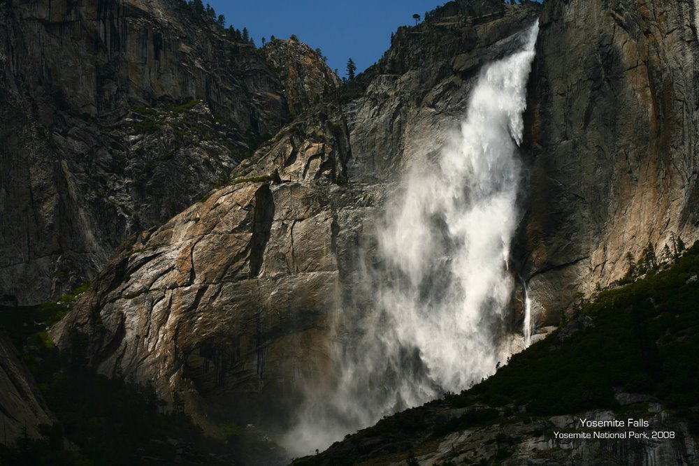
We’ve unfortunately got limited wall space – I certainly don’t want huge photos all over! – so he’s currently vascillating between printing all 3 photos below in a smaller size or printing 1 large one. But if he were to pick 1, he also can’t figure out which to choose.
So, I thought I’d take a vote: Which do you like best and think would look nice framed? (Click each one for a bigger version)
(And yes, I still haven’t done my holiday update – it’s still sitting in my draft posts! But some of these photos deserve an airing so I will get down to it…)


No.1 appeals to me!
all so picturesque! no wonder you guys have a problem! i like one and two. 🙂
Option 2!
wow, beautiful pictures! all these are taken by you guys?
I would go with 3 smaller photos because all 3 angles helps feed the mind about the different aspects of the beautiful place. If that is the same waterfall, then even more so!<BR/><BR/>But if I were to pick just one, I’ll go with No.2 because of the richer colours 🙂
i think no.1 is nice! heheh =p
candice >> yup, DD took these and more! the place is amazing seriously.<BR/><BR/>corsage>> heh, my sentiments exactly! it's not the same waterfall – the one in #2 is different from the one in #1 and #3. all beautiful (and huge!)though!
i like #2! 🙂 but all nice really. hee.
i like the tunnel view the best!
WHAO, the pictures he took look postcard-professional! using a SLR?
I like #2 :)<BR/><BR/>having 3 small pics may dilute the majesty of each picture…..my 2 cents worth…heehee!
For me, given the choice, I would go for option 1. <BR/><BR/>I don’t think the 3 smaller size side by side will work…
Option 1 for me. It feels the most dramatic and it has the best contrast:) With such a stunning shot, u guys should op for just 1 large print to maximise the visual effect.
No 1!! Wow, they all look like LOTR-quality man! Nice!
like i said, your hubs should quit his day job! :)<BR/><BR/>and i gotta say option 2 as well, even though all 3 look fantastic!! 🙂
i say one or two also. For the ‘grandeur’ effect – 1. For the colour – 2<BR/>:p daph